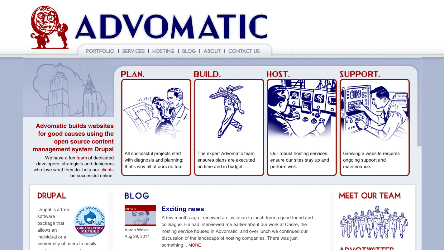
Welcome to the brand new Advomatic.com!
We designed our old site in 2009 using a toolkit for making labor union flyers from the 50s for inspiration.

We loved the vibe, but we’ve grown a lot since 2009 and felt it was time for an update. We streamlined our messaging, switched to WordPress (more on this endeavor later), and took our site from 50s labor to a sunny 60s mod theme. Have a look around!
Here are our favorite parts:
Aaron, our founder and CEO:
I love how our site really highlights our team, our mission, and our work better. It is a place that can really showcase the amazing work our team does, and fantastic clients they do it for. The previous design did a great job for a lot of years, but the new site really reflects the quality of our talent and work in a lovely way. Congratulations to everyone who worked so hard to get it up and running!
Senior Front End Developer Amanda:
What I love most about the website is that it more accurately reflects who Advomatic is, and what we do for our clients. While the previous site had it’s own (dated!) charm, the new site lets us show off our skills through the lens of the good work our clients are doing on the ground, every day. If their campaigns are successful, we know we’ve done our jobs well, and it’s a pleasure to know we have had a small hand in their victories.
Dave, Technical Lead:
It was great to be the client for once! We had fun figuring out how we wanted to restructure the site to reflect how we’ve evolved over the past few years. It really helped to clarify who we are and what we do.
Jack, Senior Front End Developer:
We got to immediately experiment here and tried out a few things we’ve wanted to try for a while, in our search of a smoother transition to a responsive web: using style tiles for our basic look and the Foundation framework for rapid UI and page layout. It’s kind of like jazz (sorry, haters of jazz) – just jump in and improv, which I think is a fun way to work.
Sarah, Developer:
It’s good that the new site better reflects what we’re capable of as far as front-end work goes, like how it’s responsive and has some neat jQuery animations and effects. And I like the typography.
Jim, Senior Developer:
It better reflects our aesthetics, both digitally and in the office.
We’re excited to show off our new look. Swing by our blog, visit our team, or drop us a line!